Share:
Former Director of Developer Education at Vonage. With a background as a creative developer, product manager, and hack day organizer, Martyn has been working as a technology advocate since 2012 having previously spent time in broadcasting and major record companies. Educating and empowering developers all over the world.
Last Christmas I Gave You My Charts A Number Insight Dashboard
Time to read: 17 minutes
If you like a freebie and you have an app that receives inbound SMS, then today's post is definitely for you.
We're going to take a look at the example Number Insight Dashboard, how you can take it away and install it for your own use and later create new graphs and visualisations for it.
Plus, you probably have a spare monitor kicking around the office that is just waiting to become the centre of attention this festive season.
The entire codebase can be found on the Nexmo Community GitHub account, and there is a live version available to remix on Glitch.
The application monitors an inbound webhook for SMS traffic. When a new message is received, information - or 'insight' - is gathered about the number that sent the message using the Nexmo Number Insight API.
These insights are then stored in a hosted MongoDB database and displayed in a browser-based dashboard.
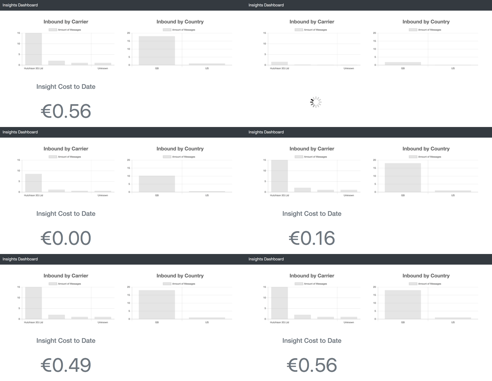
It comes with 3 pre-built visualisations out of the box:
Total number of messages broken down by carrier
Geographic spread of inbound messages
Total running cost of gathering all these insights

Number Insight API can be used to gather more information about telephone numbers that you have stored in your system. For example, they could be the telephone numbers stored as part of the contact details users had given you when they signed up.
The API returns three levels of data for a number, each with increasing amounts of detail - Basic, Standard, and Advanced. For more information on what data you'll get, take a look at the comparison table in our documentation.
For this dashboard, we use the Advanced level so we can gather as much information as possible on a number, and use it to aggregate the data for the charts that are displayed.
Our dashboard app is built using Next.js, a framework that removes some of the heavy lifting of building React applications. It handles both the client and server side elements.
The insight data is stored in MongoDB. Out of the box, this app uses mLab's free Sandbox account, but you could swap this out for your own hosted MongoDB instance if you felt you'd quickly go beyond their free tier capacity.
Client-side, the charts and graphs are displayed using the excellent Chart.js library. To make them behave nicely with React, the react-chartjs-2 package has been used.
When new insight data is received the graphs and charts update in real time. This information is pushed to the browser using Pusher. Again, the free Sandbox plan is used which offers up a vast 200,000 messages per day!
To complete this tutorial, you will need a Vonage API account. If you don’t have one already, you can sign up today and start building with free credit. Once you have an account, you can find your API Key and API Secret at the top of the Vonage API Dashboard.
This tutorial also uses a virtual phone number. To purchase one, go to Numbers > Buy Numbers and search for one that meets your needs.
To get this up and running on your local machine, start by cloning the repository:
Then, install the dependencies:
All of the API keys, secrets and other handy information that you need to change are contained in a .env file. You can copy the sample with the following command:
Open up the .env file and fill out the required information:
Once that is complete, you're ready to run the dashboard (in development mode).
In development, you should use ngrok to expose the app to the wider world so it can receive and process the inbound messages.
If you haven't used Ngrok before, check out this excellent article. It'll change your development life forever!
Note down your Ngrok URL - it'll look something like http://ghd5dgd.ngrok.io.
You'll need some inbound SMS messages to get those graphs moving. You can start setting that up by buying an SMS capable number using the Nexmo CLI:
Start by installing the CLI if you don't already have it.
Then add your credentials:
Next, search for a number to buy in your locale:
You'll see a list of numbers, pick one and buy it:
Finally, link the new number to the Ngrok URL you generated earlier:
Be sure to add the /inbound path to the end of your Ngrok URL; this is where the dashboard app receives and processes messages.
Make sure all the following are true:
You are running the app locally on port 3000
You have exposed port 3000 to the world via Ngrok
You have purchased an SMS capable number
You have linked the number to the Ngrok URL
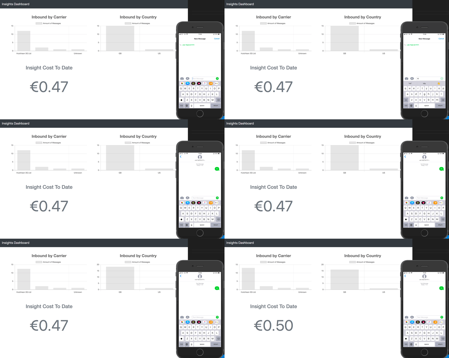
If you've ticked all of those off, then you're good to go. Send an SMS to your new number and watch the insight graphs fly!

You don't want to have this app running on your local machine forever, so you'll need to deploy it to a server where it can be accessed at any time.
The quickest, easiest way to get this up and running for yourself would be to remix the app on Glitch or use the buttons on the GitHub repository to deploy to Heroku or Now.sh.
Once you've deployed the app elsewhere, don't forget to go back and update the webhook for your inbound number so it points to the new URL.
It is also worth noting that it's very unlikely that you'll have your SMS webhook pointing directly at this in a production setting.
So, to link this up with an app that is already receiving SMS, you need to send a POST request to https://<your deployed dashboard>/inbound with a JSON body like so:
{"number": "<a number to get insight for>"}
Each graph in the dashboard is a React component so act in a very self-contained manner.
Without data, they don't do very much, so there are a couple of steps needed to make the component useful:
Decide on what data you want to display.
Aggregate the data from MongoDB as a results set.
Add a new endpoint in the
server.jsfile that the graph component will call to retrieve the data.
To explain this further, I'll break down the Countries component.
For this graph, I decided to display an aggregation of the number of inbound messages from different countries.
That data is extracted from MongoDB using a function in the db/mongodb.js file like so:
aggregateCountries: async () => {
  try {
    const records = await Insight.aggregate([
      {
        $group: {
          _id: '$country_code',
          count: { $sum: 1 }
        }
      },
      { $sort: { count: -1 } },
      {
        $project: {
          country_code: '$_id',
          country_name: true,
          count: 1,
          _id: 0
        }
      }
    ]);

    return records;
  } catch (err) {
    return err;
  }
};
The function returns JSON that looks like this:
[
  {
    "count": 16,
    "country_code": "GB"
  },
  {
    "count": 1,
    "country_code": "US"
  }
]Next, in server.js a new endpoint is required. You can check out the full file on GitHub but the pieces of code used for this particular graph are:
router.get('/countries', routes.getCountryAggregation);This specifies that a GET request can be made to /countries that triggers a function called routes.getCountryAggregation:
const routes = {
  getCountryAggregation: async ctx => {
    const records = await db.aggregateCountries();
    ctx.body = records;
  }
};
Finally, the component itself. The one that calls this endpoint can be found in its entirety on GitHub
There are two key actions the component needs to perform.
Shape the data into the structure expected by Chart.js
Apply the data to the graph and display it in the component
The updateStateData() function handles requesting the data and then shaping it for Chart.js
updateStateData() {
    axios
      .get('/countries')
      .then(res => {
        const countries = res.data;
        const labels = [];
        const datasetLabel = this.props.label;
        const datasetData = [];

        countries.forEach(country => {
          labels.push(country.country_code);
          datasetData.push(country.count);
        });

        // This is the structure expected by Chart.js
        const chartData = {
          labels, // an array of labels
          datasets: [ //an array of data sets for each label
            {
              label: datasetLabel,
              data: datasetData
            }
          ]
        };

        this.setState({ chartData });
      })
      .catch(err => console.log(err));
  }
Once the data has been structured correctly, all that is left to do is apply it to the JSX in the component so it can be displayed properly.
render() {
  return (
    <Bar
      data={this.state.chartData} // Our data goes in here
      width={10}
      height={5}
      options={{
        title: { display: true, text: this.props.title, fontSize: 25 },
        animation: {
          duration: 1000,
          easing: 'linear'
        },
        scales: {
          yAxes: [
            {
              ticks: {
                beginAtZero: true
              }
            }
          ]
        },
        maintainAspectRatio: true
      }}
    />
  );
}As you can see there are many options in here to make the graph perform in certain ways, but you could strip all that out and include something like this:
render() {
  return (
    <Bar data={this.state.chartData} />
  )
}The best way to get familiar with this pattern would be to play around with some of the other components and types of graphs that Chart.js offers, while thinking about which pieces of data from the Number Insight API you could be displaying.
If you create a new graph for this dashboard, feel free to submit a pull request, and we'll include it in the main repository along with the default graphs that people can pick from.
Share:
Former Director of Developer Education at Vonage. With a background as a creative developer, product manager, and hack day organizer, Martyn has been working as a technology advocate since 2012 having previously spent time in broadcasting and major record companies. Educating and empowering developers all over the world.
