
)
Use Web Components in Vue 2 and 3 + Composition API
Time to read: 10 minutes
This post will go over how to incorporate a Web Component into a Vue application. Examples will include Vue versions 2 and 3, plus the Composition API. Version 3 was just released at the time of this writing. It's so new that a little “New content is available.” notification frequently pops up in the documentation. Then the demo application is extended to use the Vonage Verify API.
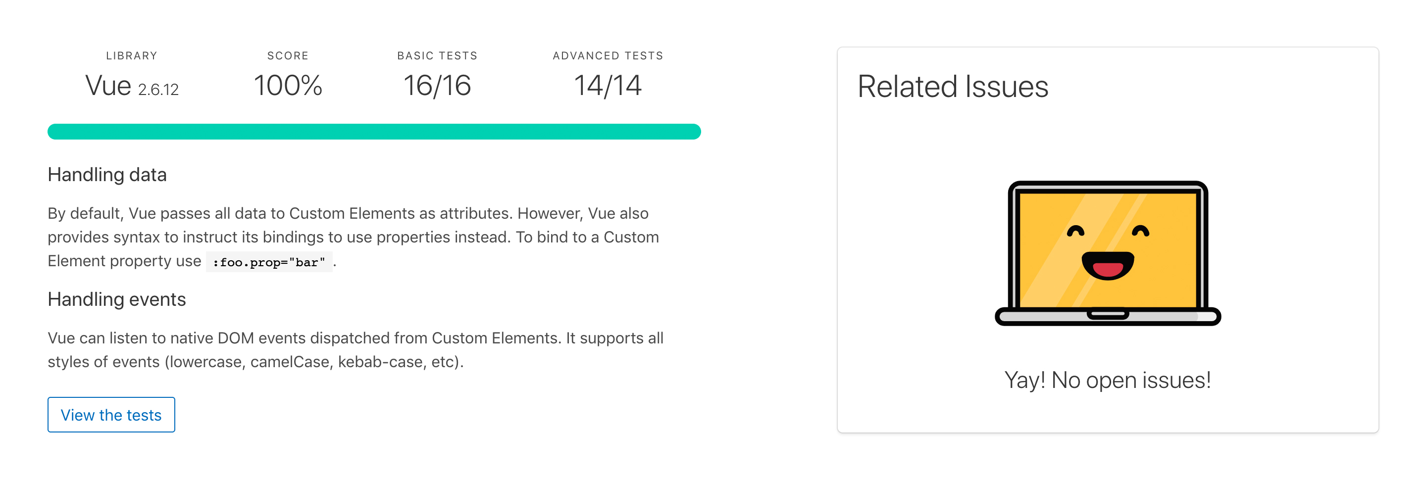 Test results from custom-elements-everywhere.com showing Vue 2.6.12 scored 100%, passed 16/16 Basic tests, and 14/14 advanced tests with an explanation.
Test results from custom-elements-everywhere.com
Note: This is for Vue 2. Vue 3 has not been tested at the time of this post.
Vue passes all the tests from custom-elements-everywhere.com, scores 100% on compatibility, and makes your laptop happy. As developers, isn’t making computers happy the main goal?
This shouldn’t be too surprising since in the Vue documentation it states:
"You may have noticed that Vue components are very similar to Custom Elements, which are part of the Web Components Spec. That's because Vue's component syntax is loosely modeled after the spec."
Things to look for when using a Web Component in a JavaScript framework like Vue. How does the framework:
know that you are using a Web Component in the first place?
handle passing data to the Web Component?
handle custom events coming from the Web Component?
get a reference to a Web Component so that a developer can gain access to things like the Web Component's methods?
There are multiple ways of configuring and installing a Vue application. (See guides for v2 and for v3.) The example code shown in this post is pretty standard.
Luckily, Vue handles data and events through the template syntax, which stays the same across the different versions.
In the previous (/blog/using-web-components-in-a-react-application-dr), one issue with using a Web Component in a React application was the way React passed data. Regardless of the type of data (e.g., strings, arrays, objects, booleans, etc.), React would stringify the values. To tell Vue that the data being passed is not a string, v-bind or : for short is used as noted in the documentation.
For example, to access and set the placeholder in the keypad component, this bit of code is added to the component's tag:
:placeholder="placeholder"Then in the data section of the Vue app, setting the initial value of the placeholder is done by
placeholder: "Enter Security Code"To change the value, the code is
this.placeholder = "SUCCESS!!!";This is standard operation for a Vue application.
I’ve recently added the ability to customize the keys in the keypad components, so I would be able to add the following to my tag and rearrange the keypad:
:keys = “[‘0’,’9’,’8’,’7’,’6’,’5’,’4’,’3’,’2’,’1’,’#’,’*’]”An example of this will be done in an upcoming blog post using another framework.
Vue can listen for DOM events (i.e., click, scroll, submit etc.) with v-on or the shorthand @. Since Web Components are treated as regular HTML elements, their custom events will work as well. To listen for the keypad component's digits-sent event, the code added to the element would look like this:
@digit-sent=”digitsSent”digitsSent is the function that will handle what comes out of the event.
Now, letting Vue know that there is a Web Component and the ways to interact with it are slightly different depending on the version of Vue and if the Composition API is used or not. Either way, Vue will let you know if you are doing it wrong by displaying a warning in the console.
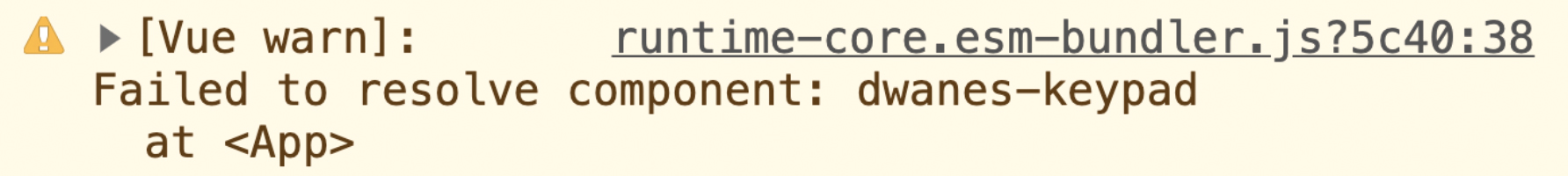 Vue console warning that it failed to resolve a component.
See the Pen Web Components x Vue 2 by conshus de OUR show (@conshus) on CodePen.
To let a Vue 2 application know that a Web Component is present, we use ignoredElements. It's an array that contains strings and/or regular expressions that expose the tag names of the Web Components. This ignoredElements is passed into the Vue configuration so that it knows to "ignore" those "elements". In the sample code, it looks like this:
Vue.config.ignoredElements = [/dwanes-\w*/];At times we might need to call a Web Component's method. For example, to clear the keypad component's display, the cancelAction method is called. Before the method can be used, a reference to the keypad element needs to be created. Vue has a similar way to React of achieving this: by adding a ref tag to the Web Component.
In the keypad component, that looks like:
<dwanes-keypad ref="keypad" ...>
Then the cancelAction is called with:
this.$refs.keypad.cancelAction();
See the Pen Web Components x Vue 3 by conshus de OUR show (@conshus) on CodePen.
Vue 3 has just come out! It's still shiny and new (and changing)!
As stated earlier, the Vue component syntax is loosely based on the Web Components Spec. So, using a Web Component in Vue 3 would be the same as Vue 2, right? Nope! There is a breaking change in letting the application know that a Web Component is being used.
More details on the change can be found in the Migration Guide under: config.ignoredElements Is Now config.isCustomElement
Custom Elements Interop.
In summary, the ignoredElements in Vue 2 becomes isCustomElement in Vue 3. Instead of an array, isCustomElement expects a function that describes what to look for. Also, now in Vue 3, the check to see if the element is an outside custom element (i.e., Web Component) is done during the template compilation.
If that template compilation is done "on-the-fly", isCustomElement is passed in the application's configuration. In the demo code, that looks like:
const app = Vue.createApp(App);
app.config.isCustomElement = tag => tag.startsWith('dwanes-')
app.mount('#app');
If the project has .vue files, then a build step is used to compile the application into code the browser can understand. In this case, the isCustomElement is passed into the options of the library doing the compiling. The library depends on what the developer decides to use. In the next section, the demo code uses webpack and will show how to include isCustomElement in the config file.
Getting a reference to a Web Component in Vue 3 is thankfully done the same way as in Vue 2, at the time of this blog post.
Vue's Composition API was created to help address some limitations developers were facing as applications grew over time and became more complex. From the documentation:
"The APIs proposed in this RFC provide the users with more flexibility when organizing component code. Instead of being forced to always organize code by options, code can now be organized as functions, each dealing with a specific feature. The APIs also make it more straightforward to extract and reuse logic between components, or even outside components."
I strongly suggest reading the Composition API documentation to get a better understanding. Here, I will focus on getting a Web Component working with it. That deals with how the reference to the component is used.
Letting a Vue application know that there is a Web Component has changed from version 2 to 3.
Depending on how the application compiles the template, it determines where to place the configuration. In the previous example, the template compilation was done "on-the-fly". This Composition API example is using Webpack to compile the template. That means the isCustomElement configuration goes in the webpack.config.js file. There you will find this code:
{
    test: /\.vue$/,
    use: {
        loader: "vue-loader",
        options: {
            compilerOptions: {
                isCustomElement: (tag) => {
                    return /^dwanes-/.test(tag);
                }
            }
        }
    }
}
Regardless of the compilation engine, there probably is a .config.js file, and that is where you would put the snippet above.
In the Composition API, the ref has grown to include tracking other values, not just DOM elements.
The ref added to the keypad component stays the same:
<dwanes-keypad ref="keypad" ...>
The first change is that ref needs to be imported:
import { ref } from 'vue';Then, the reference needs to be initialized inside setup():
const keypad = ref(null);Make sure to add keypad to the return.
This is how to access the cancelAction() method on the component:
keypad.value.cancelAction();Make sure to take note of value.
The same is done for setting and changing the placeholder text.
One thing I learned when researching for this blog post is that projects based on Vue love putting it in the name if they can. See Vuetify, Vuex, Revue, Vuedo, etc. So how could I pass up the opportunity to take the Vonage Verify API and create Vonage Vuerify?!
Give it a try!
Want to try it for yourself? First, fork the code on codesandbox.io.
Note: You will need to be signed in.
Here's how it works:
First, you'll need a Vonage developer account. Take a note of your API key and API secret found in the dashboard; you'll need these values for authentication.
Next, in your newly forked codesandbox.io project, click on the "Server Control Panel".
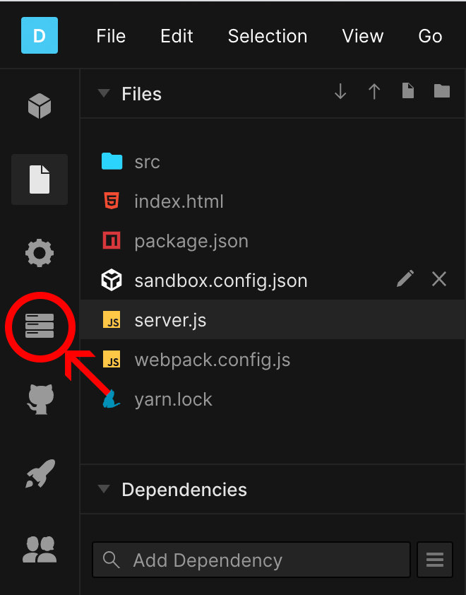 Screen capture of codesandbox.io code editor with the icon for the server control panel circled in red with a red arrow pointing to it.
Towards the bottom, there is the "Secret Keys" section. Take the API Key and API Secret from the Vonage Dashboard and place them where appropriate. Brand Name is the string that will be sent along with the security code to the user. In this case, it is VonageVuerify.
The App.vue code looks almost the same as the Composition API's code, except for how the digits sent from the Web Component are handled and sent to the Node Express backend.
If the user requests the security code, a POST request is made to the /request endpoint on the server sending along the phone number entered in the body.
Once the response comes back and is valid, the request ID is saved, the mode is changed, some text on the keypad component is changed, and the display is cleared. Otherwise, an error is displayed.
Here's the code:
App.vue
if (mode === "request") {
    // Request security code
    postData("https://qtebx-8081.sse.codesandbox.io/request", {
    number: entered,
    })
    .then((data) => {
        if (data.status === "0") {
            requestId = data.request_id;
            mode = "verify";
            placeholder.value = "Enter verification code.";
            actionText.value = "Verify Code";
            keypad.value.cancelAction();
        } else {
            keypad.value.cancelAction();
            status.value = data.error;
        }
    })
    .catch((error) => {
        console.error("Error: ", error);
    });
}
server.js
app.post("/request", (request, response) => {
  console.log("request.body: ", request.body);
  nexmo.verify.request(
    {
      number: request.body.number,
      brand: process.env.BRAND_NAME,
      workflow_id: 6
    },
    (err, result) => {
      if (err) {
        console.error(err);
        response.json(err);
      } else {
        console.log("request result: ", result);
        if (result.status === 0) {
          response.json({
            status: result.status,
            request_id: result.request_id
          });
        } else {
          response.json({
            status: result.status,
            request_id: result.request_id,
            error: result.error_text
          });
        }
      }
    }
  );
});
Note: The
workflow_idis the fallback strategy used to deliver the security code to the user. Find the various options in the documentation. This application is using Workflow 6, which sends only one SMS message.
When the user attempts to verify with the code they received, another POST request is sent to the /check endpoint on the server with the requestId saved earlier and the security code.
If the status comes back as a success, the mode is changed, the image is changed, the keypad component's text is changed, and displayed cleared. If the status is an error, it is displayed.
Here's the code:
App.vue
else if (mode === "verify") {
    // verify code
    postData("https://qtebx-8081.sse.codesandbox.io/check", {
    request_id: requestId,
    code: entered,
    })
    .then((data) => {
        if (data.status === "0") {
        //verified!!!
        mode = "success";
        placeholder.value = "Woohoo!!";
        actionText.value = "SUCCESS!!!";
        image.value = {
            src: "https://media.giphy.com/media/oobNzX5ICcRZC/source.gif",
            alt: "minion giving the thumbs up",
        };
        keypad.value.cancelAction();
        } else {
        keypad.value.cancelAction();
        status.value = data.error;
        }
    })
    .catch((error) => {
        console.error("Error: ", error);
    });
}
server.js
app.post("/check", (request, response) => {
  console.log("check request.body: ", request.body);
  nexmo.verify.check(
    {
      request_id: request.body.request_id,
      code: request.body.code
    },
    (err, result) => {
      if (err) {
        console.error(err);
        response.json(err);
      } else {
        console.log("check result: ", result);
        if (result.status === 0) {
          response.json({ status: result.status });
        } else {
          response.json({ status: result.status, error: result.error_text });
        }
      }
    }
  );
});
Note: If you fork the demo code, the endpoints called in the
App.vuewill need to be changed to reflect your project's server.
To learn more about the Vonage Verify API, you can check out the documentation.
Any questions on what was covered in this post? Have you incorporated Web Components into a Vue application another way? Got an example of how you are using the Vonage Verify API? Let us know on our Community Slack Channel.
img.alignnone { border-width: 0px !important; }