
)
Styling Web Components
Time to read: 9 minutes
A few months ago, we announced the release of a set of Web Components built to be used with the Vonage Client SDK. Create a Conversation, pass it to the components, and that's it. Each component will handle all of its responsibilities–such as listening for and sending events–leaving the developer to work on other aspects of their application. Honestly, I wasn't sure if others would find it as valuable as I thought it could be, so the elements all have the default styling.
Happy to say that I was wrong. Turns out people are using it and the main feedback was around the styling or lack thereof. So in this blog post, we'll not only go over how to style the ones for the Client SDK, but Web Components in general.
The Shadow DOM, one of the technologies that make Web Components possible, can shield a Web Component's styling from being affected by the outer application. It would be pretty bad if the application had a section tag with position: absolute and that modified the Web Component's section tag.
What if you do want to style the elements in a Web Component? It would be nice if all the buttons in your application looked the same, right?
While researching Web Components and looking at various design systems, I saw developers use CSS custom properties, also known as CSS variables. The Web Component author would create variables with something like --myelement-button-color and declare them like:
button {
  background-color: var(--myelement-button-color, red);
}Red will be the default color if the variable is not set.
In the surrounding application, you can assign a value that matches the rest of your application like this:
:root {
  --myelement-button-color: blue;
}Great! All your buttons can have the same color, but what about the button's font color? That would require another CSS variable. Want to match the border radius? Another variable. Border color? Yup, another variable.
The number of variables can quickly increase the more a Web Component is customizable. It can also be very limiting because you only have what is made available by the Web Component author.
What can we do?
This is where ::part comes in. It’s a CSS pseudo-element, like ::before and ::after, that lets you enter the Shadow DOM to style a labeled part of the Web Component. There's a good write-up of the history of how we got here by Monica Dinculescu.
As an example, here is a button that is inside the Web Component:
<button part="button">Click Me</button>In the outer application, you can style the button by targeting in like so:
custom-element::part(button) {
  color: red;
  border: 2px green solid;
  font-size: 30px;
  background-color: yellow;
}This way, the Web Component author only needs to label the different parts of the component and the user can style it however they want.
Pretty awesome, right?
With the introduction of CSS custom properties and ::part, let's take a look at the Client SDK UI Web Components and how to style them one at a time.
Each component has an embed to show the default styling. Uncomment the CSS to see an example of how the style can be customized. Feel free to add your own and try it out.
Let's start with the simplest Component, vc-typing-indicator. It's just text, so you can style it how you would style any other text in your application. Here's an example:
Up next is vc-text-input. There are two parts to this component. The input where the text is entered, labeled input, and the button to send the message, labeled button.
Now for the component responsible for displaying the messages of the chat, vc-messages. On the outer level, there's the message where its part is labeled as message. The message is composed of the message text labeled message-text and the user who sent the message is labeled username.
To differentiate between the web application user's messages and messages from others, we add mine to the message, message-text, and username parts.
Note: The example does not show a difference in the user's message from other users. This is because the user is determined from the Conversation passed to the component. Here's a screenshot of how the default style looks:
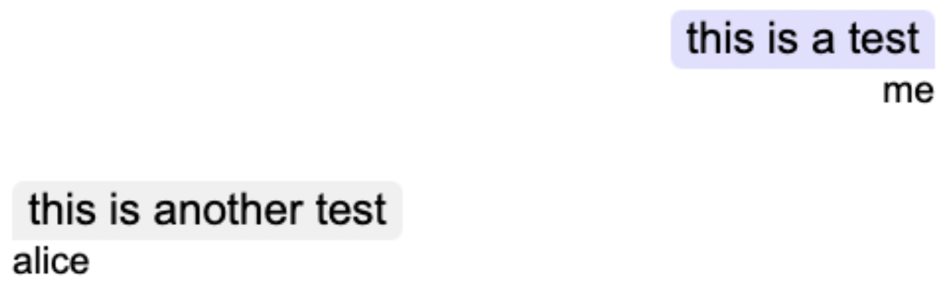 Screenshot of the default syling of the vc-messages Web Component
The vc-members component lists the members in the chat. It's an unordered list where the list is labeled ul and the items or members are labeled li. To be able to style the alternating rows to make the list easier to read, we use CSS variables --vc-members-nth-child-odd-color and --vc-members-nth-child-even-color to add some color.
Finally, here's the component with the most elements, vc-keypad. Starting at the top, the digits display is labeled input. The buttons are grouped into rows and labeled row. To target a particular row, they are labeled position1 to position5. So for example, styling part row position2 would affect buttons 4, 5, and 6.
Each button is labeled button. Just like with rows, to target a particular button, you add on its position. For example, the "#" button can be styled by targeting part button position12.
For a much more detailed explanation, including diagrams, please take a look at the Client SDK UI Web Components GitHub repo.
We've gone over how to style Web Components and presented the ones we built to work with our Client SDKs as examples.
How do you style your Web Components? Have you used our Client SDK UI Components? Let us know in our Community Slack Channel!