Share:
)
Benjamin Aronov is a developer advocate at Vonage. He is a proven community builder with a background in Ruby on Rails. Benjamin enjoys the beaches of Tel Aviv which he calls home. His Tel Aviv base allows him to meet and learn from some of the world's best startup founders. Outside of tech, Benjamin loves traveling the world in search of the perfect pain au chocolat.
Design Systems: Lessons From Vivid
Time to read: 9 minutes
Our CSS Specialist Rachel Tannenbaum gave an amazing talk when Vonage hosted Pull Request, an open-source community meetup. She gave a talk on design systems, her focus for the last 3 years. But everyone should learn about design systems, not just those lucky enough to attend a meetup. So I’ll share my takeaways from her talk in this article, answering the following questions:
What do we mean when we say design system? Why do organizations even need a design system? Are design systems the responsibility of the design team or development team? How are design systems implemented?
It All Started With Books!
The brand book was the single source of truth to maintain the integrity and uniformity of the brand.

A distant time ago, back when humans could survive without the internet companies had a brand book. This book contained the company’s brand philosophy: colors, fonts, imagery, etc. It defined different styles in different settings; e.g. a newspaper ad versus a billboard ad. Coca-Cola’s brand book, for example, even had guidelines for the shape of their glass bottles! This book made it possible to maintain the brand and its visibility, no matter who released the final product.
But today people can’t live without the internet. Single-page websites have grown into sprawling web applications with sub-sites. It’s no longer possible for a single designer to maintain a company’s application. As design teams grow to meet this challenge, a new resource has emerged to make sense of the chaos. Where the analog world had the brand book, the digital world has the style guide.
A style guide is the source of truth for a brand’s digital assets. These assets include fundamental building blocks like colors, icons, typography, and elements like buttons. It also includes more complex elements like date pickers, menus, and more. Of course, software companies that build design tools are also experimenting.
But what do style guides have to do with frontend design systems? Think of the frontend development process as similar to building with Legos. Style guides take abstract ideas like colors and shapes and transform them into a book of instructions. Design systems take those instructions and bring them into the real world, combining bricks into objects. The benefit of a design system over a style guide is that a design system contains sections of code, called components, that can be quickly reused over and over again across an application. Using components ensures brand uniformity and saves precious development time. Additionally, design systems are easily scalable and dynamic. So with design systems, you stop building code as an artisan and, instead, like a high-powered industrial factory of cute legos.
Every digital product needs a UX design system!
Ok, maybe not every digital product needs a design system. The question you need to ask your organization is, are we a Ford or a Ferrari?
Design systems can take a lot of extra time to set up and maintain. The large upfront investment is only worth it for large-scale projects where you will save time in the long run. Your team should consider how many developers would use the design system, the scope of your product(s), and the standards and communication of your development team.
So is your team a Ferrari? If you’re a Ferrari, you have a relatively small product line, with not too many repeatable components. Your products aren’t built with large scale in mind and thus economies of scale in your designs wouldn’t save your organization much.
Or are you a Ford? Do you have many products, many teams, and many designs that incorporate a large scale of pages and features? A good test is to ask yourself if you had to update the designs of all your buttons, would it be a gargantuan task or just an annoying one? If it’s a gargantuan task, you’re probably a Ford.
Simply put, good design improves user experience and maintains brand consistency through order and efficiency.
Order
Order In UI: Establishes fixed design, fixed pattern of behaviors, gestures, interactions, etc.
Order in Development: Creates order in the mess, helps clean code, and prevents code duplication.
Efficiency
Efficient Development: Decreases development time, Allows designers to make better decisions, saving your organization time and money.
Efficient Updates: - System-wide updates in a breeze.

Gmail is a great example of design systems creating order and efficiency gains. On any device, it’s clear to the user that this is a Google product. Just from the UI components, it’s clear to the user what sort of interactions they can expect. And as far efficiency, do you remember when Google moved from Material Design 2 to Material Design 3? Imagine every place that the red and purple navbars had to be changed, everywhere that the corners needed to be rounded exactly the same. Instead of huge headaches across its whole suite of products, a Design System ensured that Gmail, Google Docs, Google Slides, and all the others felt exactly the same through reusable components.

Do not build a UX design system first! Think of UX design systems in a LEAN way. You want to build the most useful, most scalable components. So you need to know which components are actually used by your design team. This means that your organization should first build its product or products and then evaluate which components are reused the most. Design systems are not for V0.1 of your product, only from V1.0 and onwards.
How can you identify which components you will need? You can always start with the most basic elements; typography, colors, buttons, etc. These elements will be widely used regardless of product. From there your design system will evolve. Nathan Curtis has an excellent (https://medium.com/eightshapes-llc/the-component-cut-up-workshop-1378ae110517) about this called, “The Component Cut-Up Workshop”, where you can see the workflow of dividing a website into the components that make up the design system.
At Vonage, our design system went through many iterations. The first project was called Volta and largely helped to standardize CSS. Then as the project gained more support from leadership, it became known as Vivid.
Vivid-2 was based on Material Design. Soon we realized that this was problematic in several ways:
too heavy for what we needed
not communicative to the community and change/bugs requests
not aligned to the spec
not fully accessible
not meant to be base for creating a design system upon it
Moving from Vivid 2 to Vivid 3, we decided to totally rethink everything. So we used the Fast library from Microsoft as our base. We chose Fast because it’s purposely built as a design system foundation. At the same, it’s lightweight but also continuously evolving to add new components and features. And most importantly it’s built in accordance with W3C & OpenUI.
Not only does Vivid-3 have all the advantages of Fast but also improved:
test coverage - going from 70% to 100%
documentation - with ready-to-go code snippets, making it easy for developers to simply copy/paste what they need
accessibility - in accordance with WCAG 2
white labeling
Your design system should act as a bridge. Build your team with the right stakeholders, who will each share their expertise and mold the design system to meet the needs of each business function.
Who is responsible for building the design system? In short - the development team. The development team should have primary responsibility for the creation of the design system, but it is not solely responsible. One of the most important advantages of a design system is that it acts as a bridge between your designers and developers. The design system acts as a guide, providing a common language to clarify communication between developers and designers. The more responsibility shared between these teams, and the more input from each team is invested in the creation of a design system, the better the final product will be and improve synergies across your organization.
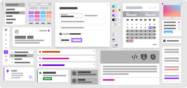
In parallel with our API, we maintain a component library in Figma for the designers. When they are working on the design of a page, app or anything, they can quickly add Vivid’s asset library to their design components. This way they keep a uniform design. In the final Figma file, the developers have everything they need to code: exactly which components to use and their exact pixel-perfect specifications (size, shape, font, etc.).

In addition - we export design tokens for colors, typography, and sizes from Figma to use in the code library. The cool thing about design tokens is that by changing the Figma of one of the tokens and exporting it will automatically make the same change in Vivid as well.

Vonage is a very large company with many teams of developers working on a wide range of products. This results in a large number of front-end development libraries being used across the company: Vue.js, React Native, Angular, and more. Vivid’s mission is to unify the design across all these projects. For Vivid we identified 3 core concerns: scalability, cross-framework uniformity, and accessibility. We need Vivid to update uniformly across a massive array of products. We need it to ensure the end result is independent of the frontend framework. And lastly, we need to make sure the solution is up to the latest accessibility standards.
To fit this need, Vivid is based on web components.
Web Components are a suite of different technologies allowing you to create reusable custom elements — with their functionality encapsulated away from the rest of your code — and utilize them in your web apps. Basically, the final product of a web component is HTML, CSS, and Javascript which means it can adapt to any development environment. To learn more, I recommend reading Getting Started with Web Components.
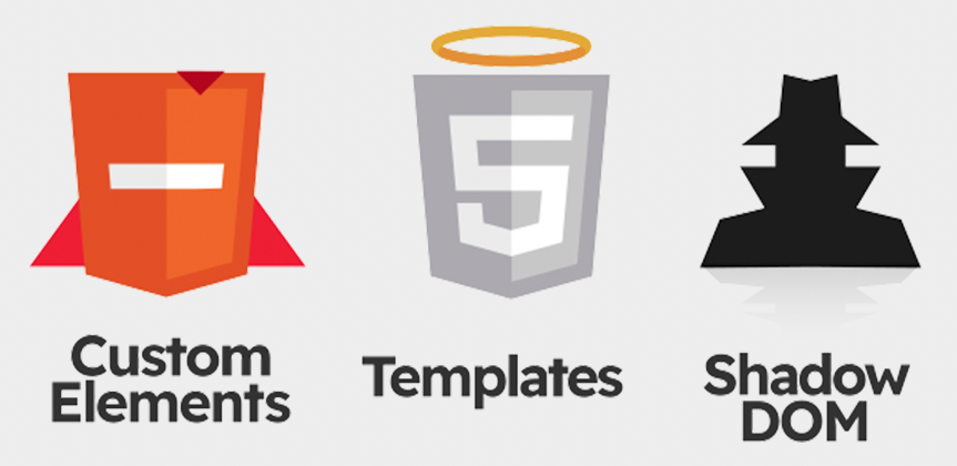
Custom element
This is the “host” element. It will be seen in the DOM and will usually have a unique name. For example, in Vivid components, the name of the custom element always starts with vwc. These initials stand for Vivid Web Components. The second part of the element is the name of the element which acts as a description of its purpose. For example vwc-button, vwc-dialog, etc.
Shadow-dom
A kind of "sub-dom" hidden from view, it is under the host element, the custom element. It allows a component to have its very own “shadow” DOM tree, that can’t be accidentally accessed from the main document, may have local style rules, and more.
Template
Inside the shadow-dom we can see the html template that contains the elements or parts of the component.
Vivid's web components require users to define the components according to their needs (text, icon, etc.), and in return, they will receive fully functional and designed components, with almost no coding and without messing with the HTML structure of the component itself.
For example, to add a Modal to the project all you need is this:
Under the hood, inside the shadow-dom, all this code will actually be added to the project:
<vwc-elevation dp="12">
  <dialog class="base icon-placement-side hide-body hide-footer" open="">
  <slot name="main">
    <div class="main-wrapper">
      <div class="header border">
        <slot name="graphic">
          <vwc-icon class="icon" name="info"></vwc-icon>
        </slot>
        <div class="headline">Dialog Headline</div>
        <div class="subtitle">subtitle content</div>
        <vwc-button size="condensed" class="dismiss-button" icon="close-line">
        </vwc-button>
      </div>
    </div>
  </slot>
  </dialog>
</vwc-elevation>And to ensure that the Dialog opens inside a Modal, the opening must be activated with a functionshowModal.
<script>
  function openDialog() {
    dialog = document.querySelector('vwc-dialog');
    dialog.showModal();
  }
</script>The final product will look this:

Of all the tools that help with design system development, Storybook is probably the most popular. But for all its advantages, it doesn’t easily handle web components properly. It doesn’t correctly display components’ code or generate code snippets for developers.

For this reason, Vivid's documentation is built with…Vivid! Using our own components led to improvements to the components themselves and their documentation.
Using the components outside of the development environment is essential. Having said that - design system developers should always remember that they are not the users of the library. Don't assume the way you use the components will be the only way or the right way, be communicative with your users.
Now that you know a bit more about how we built Vivid, you should go ahead and try it out! Check out the storybook or Github repo. We’d love to see what you’re building with Vivid or hear about your own experiences building a design system. Drop us a message on the Vonage Developer Community Slack or on Twitter.
Share:
Benjamin Aronov is a developer advocate at Vonage. He is a proven community builder with a background in Ruby on Rails. Benjamin enjoys the beaches of Tel Aviv which he calls home. His Tel Aviv base allows him to meet and learn from some of the world's best startup founders. Outside of tech, Benjamin loves traveling the world in search of the perfect pain au chocolat.