SMS Analytics
Monitor your SMS traffic with detailed metrics including message volume, delivery rates, and cost breakdown by country and network.
Access SMS Analytics
- Log in to your Vonage Dashboard
- Navigate to Monitor → Analytics → SMS in the left sidebar.
View Analytics Tabs
Switch between different analytics views using the tabs at the top:
Overview
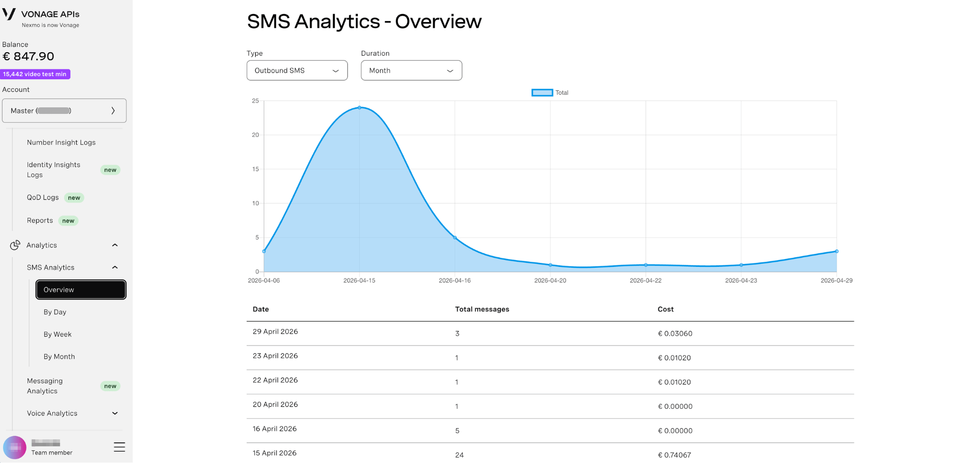
High-level summary of your SMS activity with visual graphs and key metrics:
Area Chart Visualization:
- Blue shaded area - Total SMS volume over time
- X-axis - Date range
- Y-axis - Number of messages
- Interactive - Hover over points to see exact message counts and dates
- Trend visualization - Quickly identify peaks, valleys, and traffic patterns
Key Metrics Cards:
- Total messages sent and received
- Outbound vs. inbound ratio
- Cost summary for the selected period
- Quick insights into traffic patterns
Data Table (below graph):
- Date-by-date breakdown
- Outbound, Inbound, and Total message counts
- Cost data per period
By Day
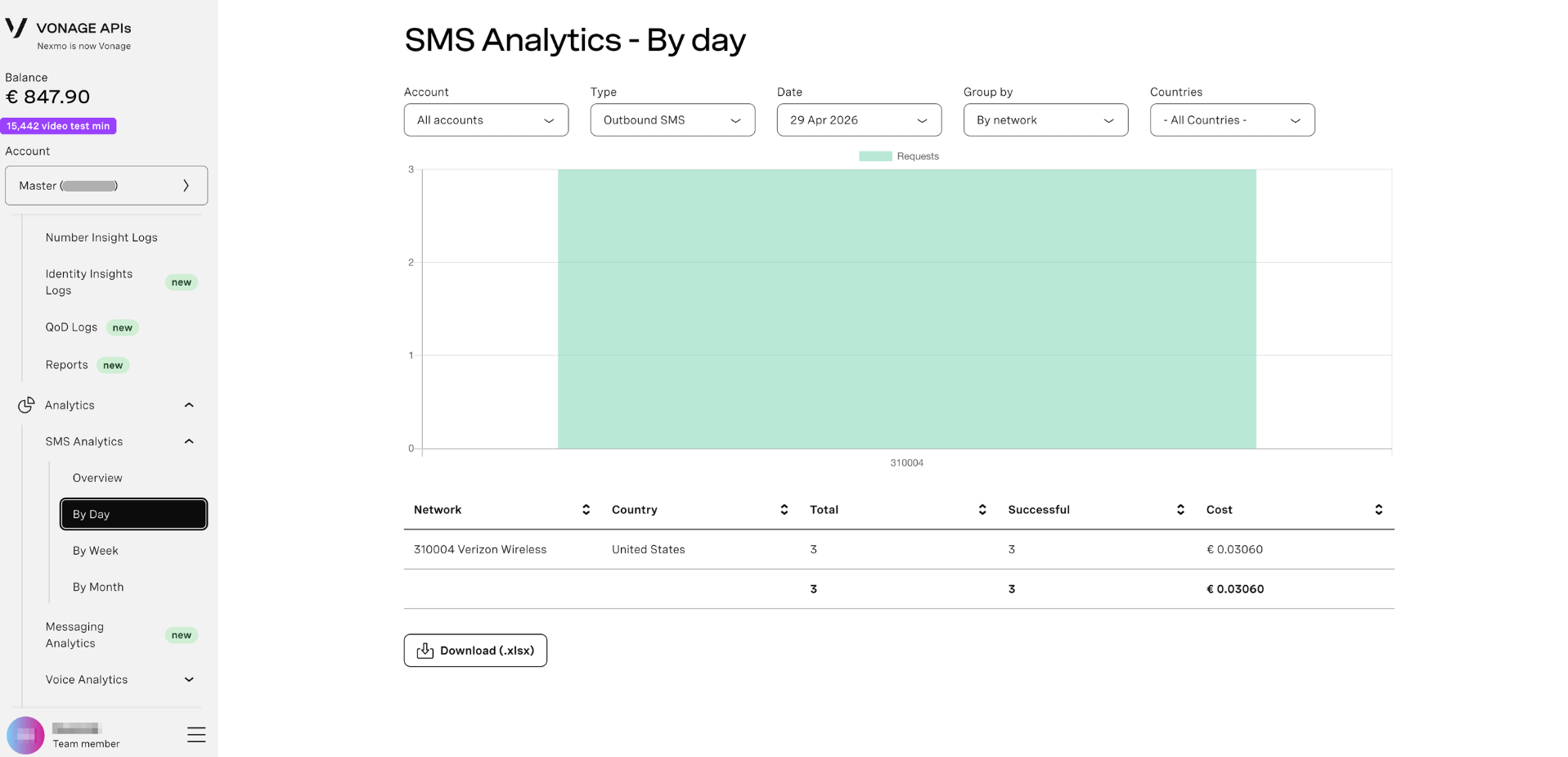
Daily breakdown of SMS activity with detailed granularity:
Line/Bar Chart:
- Visual representation - Daily message volume displayed as bars or line graph
- Comparison view - Separate visualization for Outbound (blue) and Inbound (green) messages
- Trend analysis - See day-over-day changes at a glance
Data Table:
- Date column - Each day in the selected range
- Outbound column - Messages sent
- Inbound column - Messages received
- Total column - Combined traffic
- Sort by clicking column headers
By Week
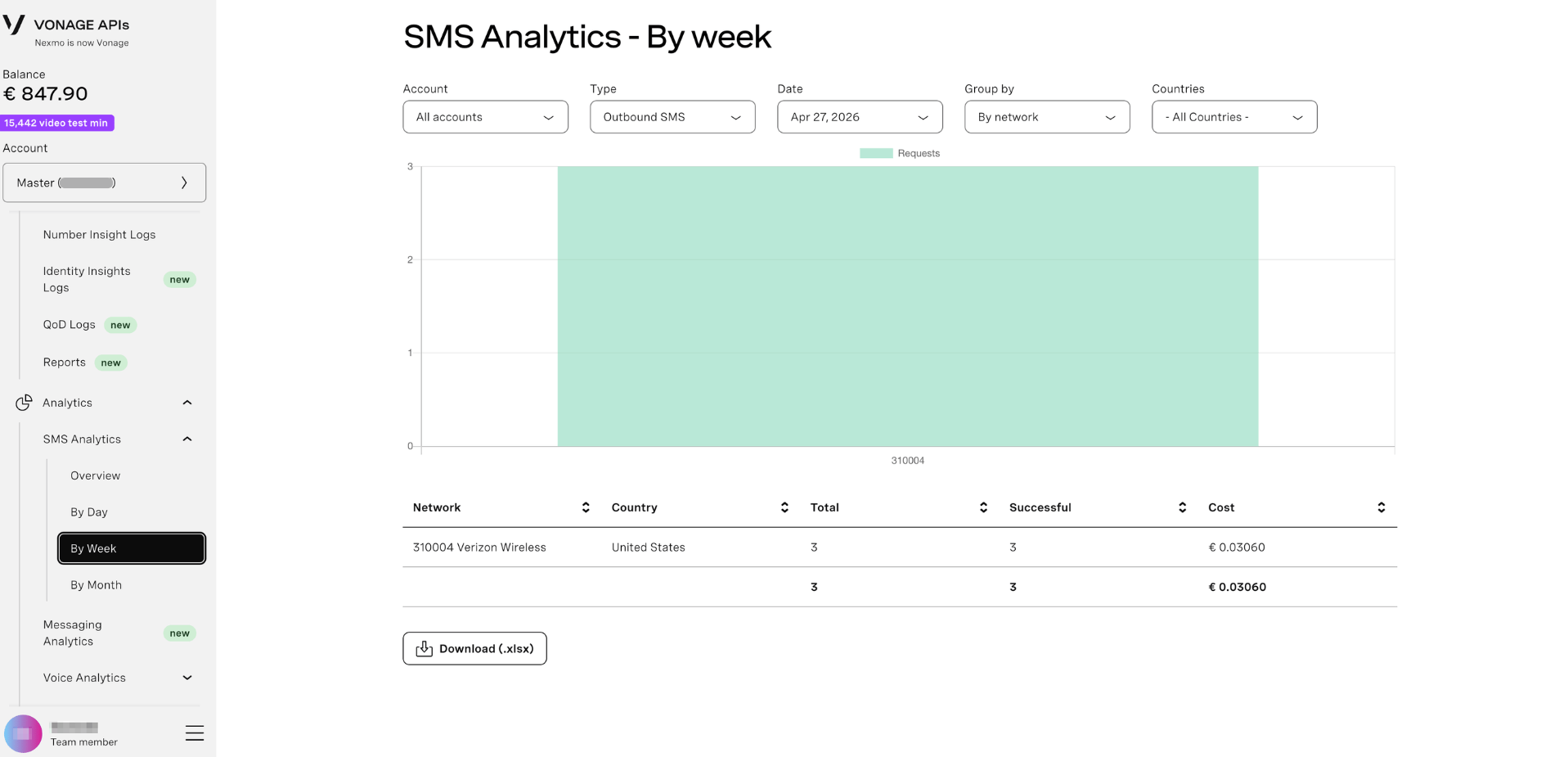
Weekly aggregated SMS data with smoothed trends:
Weekly Chart:
- Aggregated visualization - Weekly message volumes shown in chart form
- Reduced noise - Weekly aggregation smooths out daily fluctuations
- Pattern detection - Easier to spot week-over-week trends
Data Table:
- Weekly message volumes
- Outbound, inbound, and total counts
- Easier to spot weekly trends and compare performance
By Month
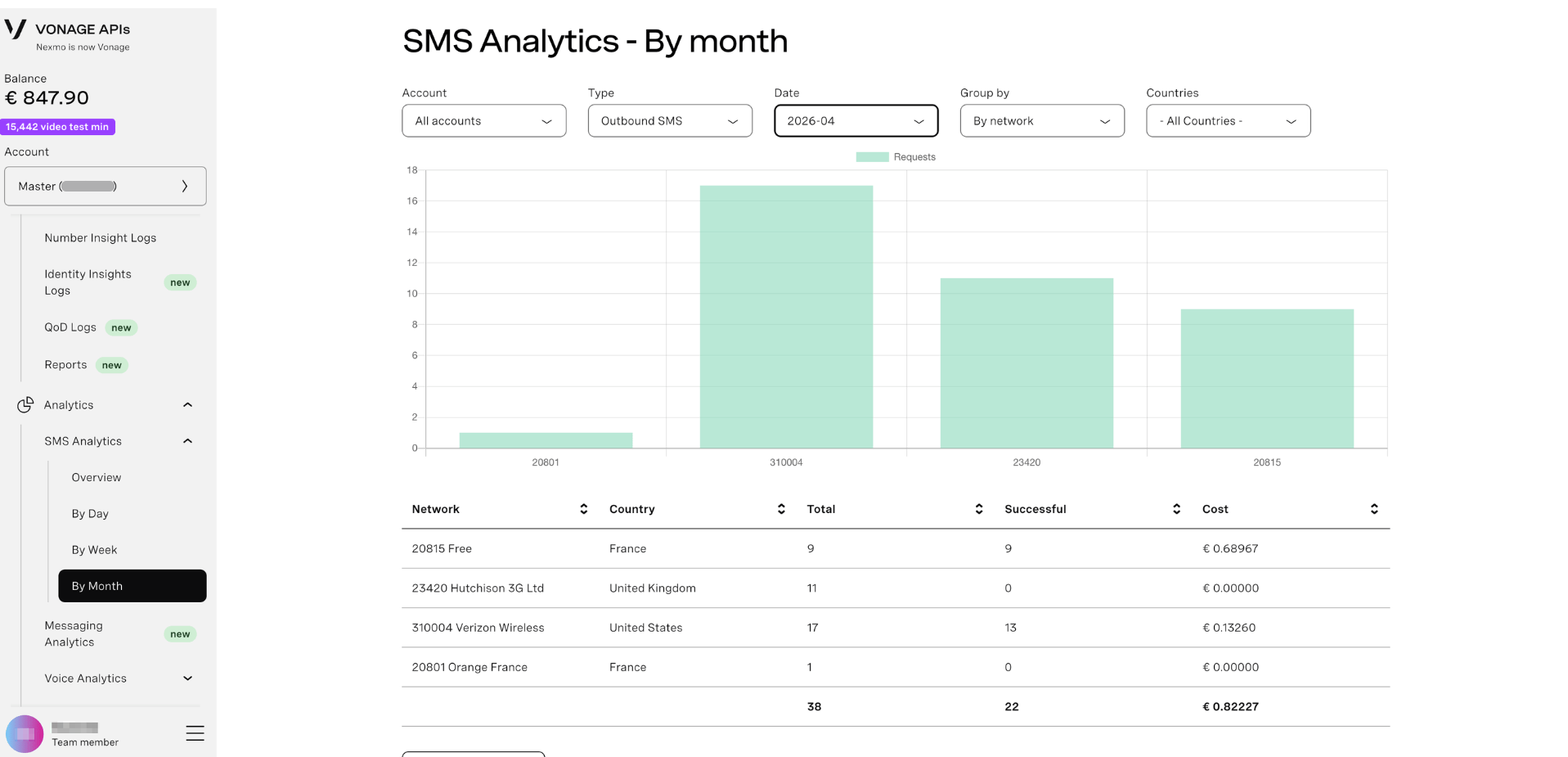
Monthly SMS traffic overview for long-term analysis:
Monthly Chart:
- Long-term trends - Month-by-month message volume visualization
- Seasonal patterns - Identify recurring seasonal trends
- Growth tracking - See how usage evolves over months
Data Table:
- Month-by-month comparison
- Long-term usage patterns
- Seasonal trend analysis
Understanding the Graphs
The visual charts in SMS Analytics provide quick insights:
- Peak detection - Easily spot high-traffic days, weeks, or months
- Trend analysis - See if SMS usage is growing, declining, or stable
- Anomaly identification - Unusual spikes or drops are immediately visible
- Time-series comparison - Compare different time periods side-by-side
- Outbound vs. Inbound patterns - Visual color coding distinguishes message direction
Interactive Features:
- Hover tooltips - See exact values by hovering over any data point
- Zoom controls - Some views allow zooming into specific time ranges
- Legend toggle - Click legend items to show/hide specific data series
Filter Your Data
Use the filter controls at the top to narrow your analytics:
Date Range
Select the time period to analyze:
- Click the From date picker to choose start date
- Click the To date picker to choose end date
- Use preset ranges (if available) for quick selection
Direction
Filter by message direction:
- All - Both inbound and outbound
- Outbound - Messages sent from your account
- Inbound - Messages received to your numbers
Country
Filter by destination or origin country:
- All countries - View combined data
- Select specific country - Drill down to regional performance
Tip: Filters apply to both the graphs and data tables. Use them together to drill down into specific time periods, countries, or message directions.
Understanding the Data Table
Each tab displays a table with SMS metrics below the graphs:
Columns:
- Date/Week/Month - Time period (depending on active tab)
- Outbound - Number of messages you sent
- Inbound - Number of messages you received
- Total - Combined inbound + outbound count
Features:
- Sortable columns - Click headers to sort ascending/descending
- Pagination - Navigate through multiple pages of data (if applicable)
- Row highlighting - Hover over rows for emphasis
- Totals row - Bottom row shows aggregated sums
Export Analytics Data
Click the Download button to export your filtered analytics as a CSV file for spreadsheet analysis or reporting.
CSV includes:
- All visible table data
- Date/time stamps
- Message counts (Outbound, Inbound, Total)
- Cost data (if available)
- Filtered results only (respects your current filters)